We hope you enjoy reading this blog post
If you need help with website or marketing, book a call with our team for a free 360° overview and actionable recommendations report. Book a call

If you need help with website or marketing, book a call with our team for a free 360° overview and actionable recommendations report. Book a call

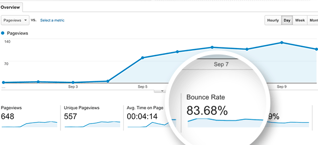
Bounce rate is something that every website owner must deal with since so many visitors have a tendency to view only one page before leaving. Yet visitors who view only the first page are usually of little value, and reducing bounce rate should be one of the primary goals of any website owner. Fortunately, there a few relatively simple steps that you can take to drastically reduce your bounce rate and improve the user experience on your website. Below, we’ve outlined some of the top steps you can take to ensure that people who come across your website are more likely to stick around.
Long load times is one of the number one reasons people navigate away from a website. As a society, our average attention span has reached an all time low, and just a few seconds of extra load time is often all it takes to make your bounce rate skyrocket. This is especially true for mobile users, who may often be dealing with slower connections than they would normally have on a desktop as well as an even lower patience since mobile users are usually faced with more distractions than they would be if they were behind a desktop.
In order to keep your web pages loading as fast as possible, you will want to make sure that all your graphics and images are compressed and optimized and remove any hard-loading graphics. To check the page speed on your website, there are a variety of free tools, including Google Page Speed tool, Pingdom and Google Analytics.
Well-written content for your blog is important, but well-written content for your website’s homepage is even more crucial. If the content on your homepage is well written and engaging, people will be far more likely to explore the rest of your website.
In creating a homepage, many website owners succumb to the temptation of writing for search engines rather than people. While SEO is immensely important, your homepage is the last page you want to be stuffing with keywords in a way that negatively impacts readability. Instead, fill your homepage with well-written, relevant content designed to engage users and invite them to explore your website further.
No one likes pop-up ads. In fact, they’ve become the scourge of the digital age, listed alongside the likes of mosquitoes and stubbed toes as one of life’s many irritants. It goes without saying, then, that having an abundance of pop-up ads on the homepage of your website is almost certain to increase your bounce rate.
Monetizing your website with pop-up ads may be tempting, but anything that drives away visitors is not an effective long-term strategy. Instead, find other ways to monetize your website such as working toward conversion to sales.
Websites need to pass the eye test, and one of the most important factors in keeping your bounce rate down is having a website that is visually appealing and easy to navigate. This can be accomplished in part by incorporating crisp images, text that is broken up into small paragraphs of engaging content, and useful widgets.
If you yourself don’t have an eye for web design or the technical skills to bring your vision to life, a good web designer can be an immensely helpful resource to aid you in creating a home page designed to reduce your bounce rate and increase your conversion rate.
If people who visit your website find exactly what they need on the first page and are offered no incentive to explore your website further, there’s no reason for them to stick around. You need to approach designing your website as if you are leading your visitors on a journey. Offer suggestions via hyperlinks, buttons, and other widgets about what they should view next, guiding them through the pages of your website step by step.
Always make sure, though, that the steps you are leading them along follow a logical path that your visitors would actually be interested in continuing along. For example, if your homepage is explaining the benefits of SEO, you wouldn’t want the next step in the journey you create to lead visitors to an article about manufacturing. Instead, a logical next step might be to take your visitors to an article about the benefits of hiring SEO services, and from there to a page where they could contact you to learn more about the SEO services you offer.
In the end, creating a journey is intended both to engage users and to lead them down your sales funnel. Always direct them toward content they will find interesting, but also content that convinces them step by step to purchase your product or hire your services.
Few things are more effective at getting people to stick around on your site than a valuable offer. While you might consider your products or services your website’s offer (and, in a way, they are), these things aren’t always enough to keep people interested in your website. After all, these are offers that your visitors will have to pay for, and people don’t part with their money easily.
Instead, reduce your bounce rate and increase the number of leads you generate by providing an offer that visitors can’t resist. Most often, this comes in the form of something free, such as a free ebook, free trial, free consultation, free sample, and so on. To claim these things, the only thing that should be required of your visitor is an email address. This way, you are not only encouraging visitors to explore your site further by offering them value at no charge, you are also collecting leads for your email marketing campaigns – leads that are proven to be interested in your product, services, or content since they took the time time to claim your free offer.
There are a lot of steps you can take to reduce your bounce rate, some of the most effective of which we have outlined in this blog post. Yet which adjustments will end up working the best will depend on your specific website and audience. There is no “one size fits all” solution to reducing bounce rate, no set of images you should use or paragraphs of content you should copy over. Instead, you will need to continuously test new designs, features, layouts, and content strategies to see how they affect the bounce rate on your website.
Only by implementing a process of constant improvement will you be able to eventually optimize your website to its best possible design – one that is built to increase time spent on the site as well as increase your conversion rate.
Statistics have shown a direct correlation between the amount of time spent on a website and the website’s conversion rate. The bottom line is that the more time people are spending on your site, the more engaged they are and the more likely they will be to take desired actions such as signing up for a mailing list or making a purchase. By following the tips outlined in this guide, you will be well on your way to creating an interesting, engaging website that people will want to explore further.
Please complete the form below and one of our team members will be in touch shortly.