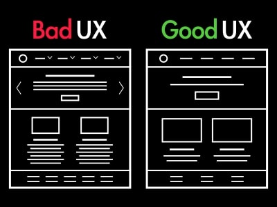
User experience or UX design is the invisible hand shaping our interactions with technology. It is a topic close to every digital consumer’s heart. We’ve all experienced the highs of seamless apps and the lows of frustrating websites. One glaring issue is the lack of clarity. Users crave intuitive interfaces, but when buttons are confusingly labeled or placed haphazardly, it creates unnecessary roadblocks. Think of it like entering a room and not finding the light switch; you’re left fumbling in the dark, unsure of where to go.
Today, let’s delve into the common user frustrations stemming from bad UX design with solutions for design and functionality improvements.
Cluttered Interfaces
Picture a website bombarding you with pop-ups, ads, and notifications, obscuring the content you came for. It’s like trying to read a book while someone continuously waves their hands in front of your face. This visual noise not only distracts but can also be overwhelming, pushing users to abandon ship in search of calmer digital waters.
Solution
- Designers can declutter interfaces by prioritizing essential elements and eliminating unnecessary distractions. By embracing clean layouts, intuitive navigation, and well-organized content, users can seamlessly find what they’re looking for without being bombarded by excessive pop-ups or ads.
- Thoughtful spacing and clear visual hierarchy guide users’ eyes naturally, allowing them to focus on the core features or information. By implementing collapsible menus, where additional options are hidden until needed. This helps maintain a tidy interface without sacrificing functionality. Moreover, designers should prioritize content relevance, ensuring that what users see aligns with their needs and preferences.
- Regular usability testing with diverse user groups can provide valuable insights, helping designers identify elements causing confusion or clutter. By fostering a minimalist approach and continuously refining the interface based on user feedback, designers can create digital spaces that are visually appealing, user-friendly, and free from unnecessary clutter, offering a more pleasant experience for everyone.
Clear and timely feedback
Feedback, or the lack thereof, is a significant source of user exasperation. Imagine submitting a form and receiving no confirmation, leaving you doubtful about whether your action was successful. It’s akin to shouting into the void – the uncertainty erodes trust and leaves users questioning the reliability of the platform. Clear and timely feedback is the glue that holds user trust together.
Solution
- Addressing the issue of clear and timely feedback in website UX design involves creating a responsive and communicative digital environment. Designers can incorporate subtle yet effective visual cues, such as color changes or checkmarks, to instantly confirm successful actions. Additionally, implementing concise and user-friendly error messages that pinpoint the issue and offer solutions can prevent confusion. Real-time feedback, like immediate form validation, helps users rectify mistakes on the spot, enhancing the overall experience.
- In addition, regularly testing the website with real users provides invaluable insights into their interactions, allowing designers to refine feedback mechanisms based on genuine user experiences. Furthermore, incorporating progress indicators for tasks like form submissions or file uploads assures users that their actions are being processed, mitigating any uncertainty.
Lack of Personalization
Personalization in UX design is crucial because it transforms digital interactions into tailored, meaningful experiences for users. It is the cornerstone of modern UX design but often falls short. Users appreciate platforms that understand their preferences, but bad UX design treats everyone as a uniform entity. Imagine a store where the salesperson insists on showing you products you have no interest in – it’s a frustrating experience that leaves you feeling undervalued and misunderstood.
Solution
- Addressing personalization in UX design goes hand in hand with engineering solutions. The process involves a meticulous understanding of user behaviors and preferences. Comprehensive user research methods, including surveys, interviews, and usability testing, provide valuable insights into user needs. UX designers can utilize this data to create user personas and map out user journeys, tailoring specific features and content to different user segments.
- Technology, such as machine learning can analyze real-time user data to dynamically personalize content and recommendations. Contextual personalization, considering factors like location and device, ensures that the information provided is relevant and timely. Many CMS systems such as WordPress and Drupal offer such solutions out of the box.
Here is a great article by WP Engine about the different types of personalization.
Accessibility
Every user deserves a seamless experience, regardless of their abilities. Bad UX design overlooking features like screen readers or keyboard navigation, excludes people with disabilities. It’s akin to constructing a building with no ramps or elevators – it effectively bars access for a significant portion of the population.
Solution
- A robust solution for accessibility concerns in UX design involves adopting inclusive practices that cater to users of all abilities. Designers should adhere to established accessibility guidelines, such as the Web Content Accessibility Guidelines (WCAG), to ensure the interface is perceivable, operable, understandable, and robust for everyone.
- Providing alternative text for images, ensuring proper color contrast, and offering keyboard shortcuts are fundamental steps. Implementing scalable fonts and intuitive navigation aids users with visual impairments and cognitive disabilities. Testing the design with assistive technologies like screen readers helps identify potential issues, allowing for necessary adjustments. For an in-depth guide, read our article on compliance and accessibility here.
Mobile responsiveness
Mobile responsiveness is crucial in our smartphone-dominated world, and still often overlooked. Non-responsive designs force users to pinch, zoom, and swipe endlessly, similar to solving a complex puzzle. It’s a jarring experience that sends users searching for alternatives, where the interface adapts seamlessly to their device. Mobile-first design prioritizes essential content and functionalities, promoting simplicity and clarity, which is vital in the limited screen space of mobile devices. It not only enhances user satisfaction by providing a consistent experience but also improves accessibility, accommodating users on the go.
Solution
Designing a mobile-first UX is like crafting a well-organized suitcase for a traveler—it’s all about packing essentials and ensuring they’re easily accessible.
- Start by identifying the core features your users need on the go; these are your must-have items. Think of the mobile screen as a compact suitcase; you can’t fit everything, so prioritize what matters most. Opt for simplicity in design, using clear and concise language. Imagine your users tapping and swiping—make buttons large enough and well-spaced for easy touch.
- Embrace the vertical scroll, a natural movement on mobile, and organize content sequentially. Test your design on actual mobile devices; it’s like trying out the suitcase to see if everything fits and is easily reachable.
- Collaboration between designers and developers is key, akin to having a seamless zipper on the suitcase. Remember, in this mobile-first journey, the user experience should be smooth, intuitive, and delightful, just like a well-packed suitcase simplifying a traveler’s journey.
In the grand tapestry of digital experiences, user frustrations with bad UX design are like knots in the thread – they disrupt the flow, creating discomfort and dissatisfaction. As we navigate the digital realm, it’s crucial for designers to unravel these knots, creating experiences that are intuitive, efficient, and, most importantly, respectful of the user. Only then can we truly harness the transformative power of technology, making it a tool that enhances lives rather than causing exasperation.

